
ST. LOUIS — Anheuser-Busch on Tuesday unveiled a new logo, favoring an all-gold design that flips the beer giant's iconic eagle to the right.
The brewer, part of Belgium's AB InBev, described the design as "more premium" and "forward looking."
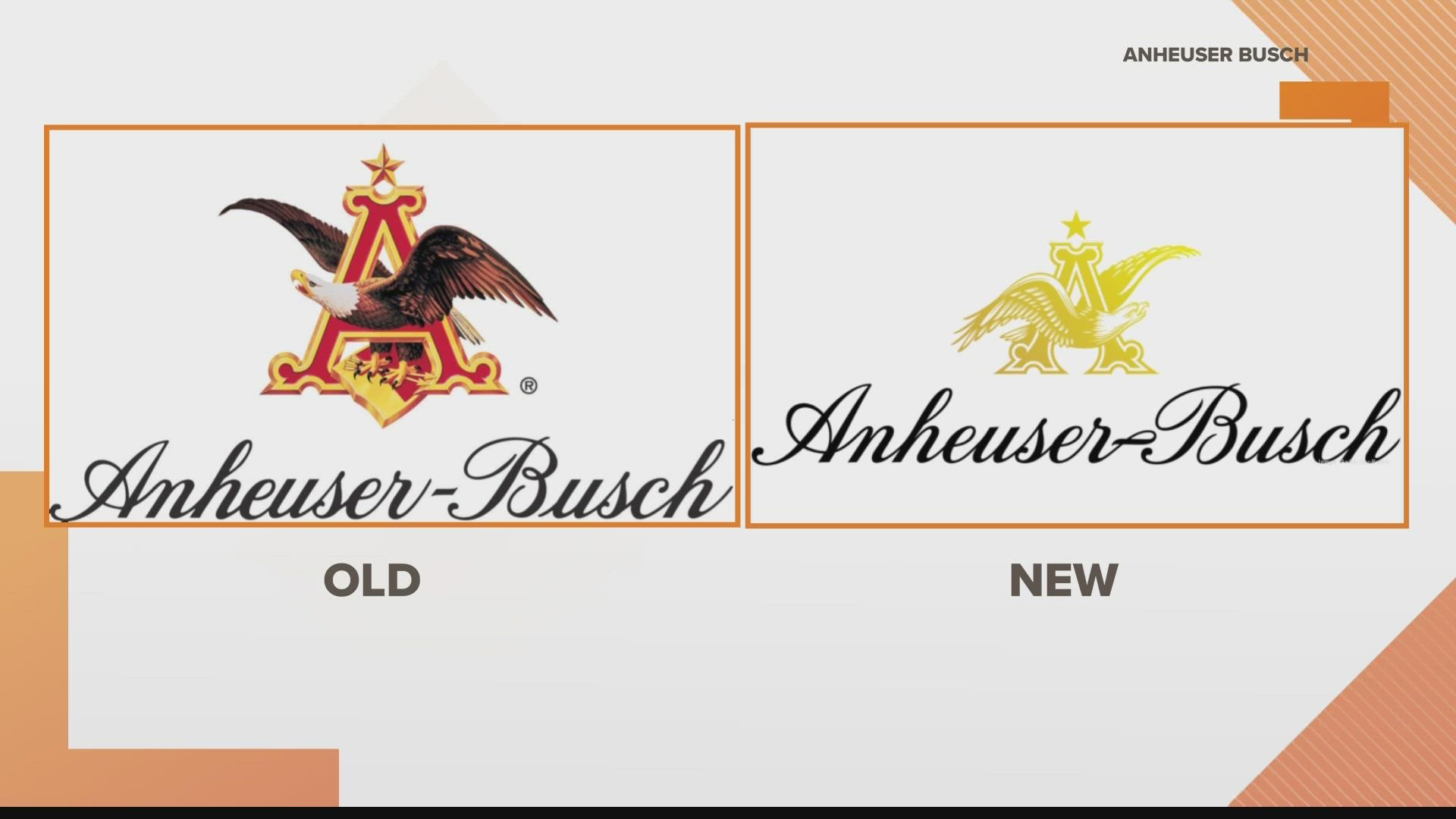
The company further described the change:
"The new look is equal parts inspiration and aspiration – respecting the company’s proud heritage while looking forward to its bright future. The 'A&Eagle,' one of Anheuser-Busch’s most distinctive assets, is now rendered in a dynamic gold color that mirrors the golden hue of beer and barley, the cornerstones of Anheuser-Busch’s business. The eagle is now facing to the right and firmly in flight, boldly gazing into the future."
Anheuser-Busch's CEO, Brendan Whitworth, said in a press release that "we have the opportunity to accelerate our momentum and positively impact even more people, and this evolution of our visual identity helps reflect the ongoing transformation of this great company."
"I’ve never been more confident that our best is yet to come," he added.
A spokeswoman for A-B said San Francisco-based consultancy Prophet designed the "new visual expression."
"Prophet also worked with Anheuser-Busch’s parent company AB InBev to develop a new corporate brand identity that represents our new global purpose and that is cohesive with A-B," she said.
Click here for the full story from the St. Louis Business Journal.